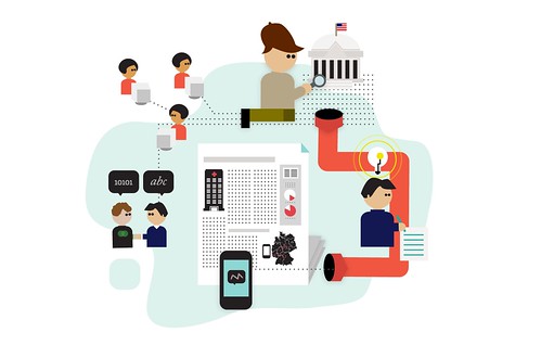
Illustrations for the Data Journalism Handbook
April 02, 2012
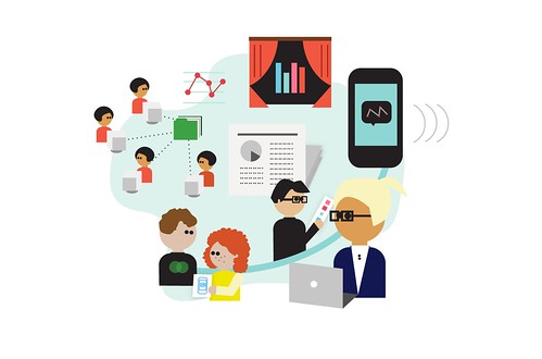
Here is a preview of some illustrations for the Data Journalism Handbook, a free, open source reference book which shows how journalists are using data to improve the news.
They were created by the talented Kate Hudson, based on the original designs she did for the book at MozFest 2011.
If you want to be notified when the book is released, you can sign up on the website.
CHAPTER 1: INTRODUCTION
What data journalism is and what it might mean for news organisations. Leading data journalists tell us why they think it is important and what their favourite examples are. Finally data journalism is examined in its broader historical context.
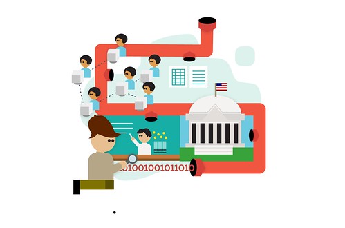
CHAPTER 2: IN THE NEWSROOM

How data journalism sits within newsrooms at the Australian Broadcasting Corporation, the Chicago Tribune, the Guardian, the New York Times, the Zeit Online, and elsewhere. We learn about how to hire developers, how to engage people around a topic through hackathons and other events, cross-border collaboration, and business models for data journalism.
CHAPTER 3: CASE STUDIES
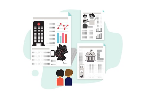
Data journalists tell us about projects that they have worked on – from election monitoring to looking into how public funds are spent, from covering corruption and riots to in depth investigations into education and healthcare.
CHAPTER 4: GETTING DATA
Where to find data on the web, how to request it using freedom of information laws, how to screen scrape and crowdsource it, and how you can republish it and give others permission to reuse it.
CHAPTER 5: UNDERSTANDING DATA
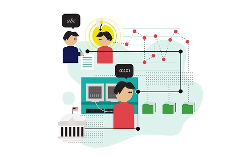
How to make sense of your data – including tips on working with numbers and statistics, how to get stories from data, data journalists’ tools of choice, and how to use data visualisation to find insights in data.
CHAPTER 6: DELIVERING DATA
How to deliver your data to the public – from news apps, to data visualisations, to engaging audiences around your project.